A real table, and why that is the whole feature
Most comparison tables on Shopify storefronts are a CSS grid of <div>s. They
look identical to a real table and they are not one.
A comparison is the single content pattern where the layout is the meaning. In
a real <table> with scope="col" and scope="row", a screen reader in table
mode announces "Waterproof, row 3, Ours: yes" — the headers travel with the
cell, so the answer arrives attached to its question. In a grid of divs the same
cell announces "yes", and the customer has to hold the whole layout in their
head to know what it answered.
That is two attributes. It is also the difference between a section a blind customer can use and one they cannot, on a page whose entire job is helping somebody decide between two things.
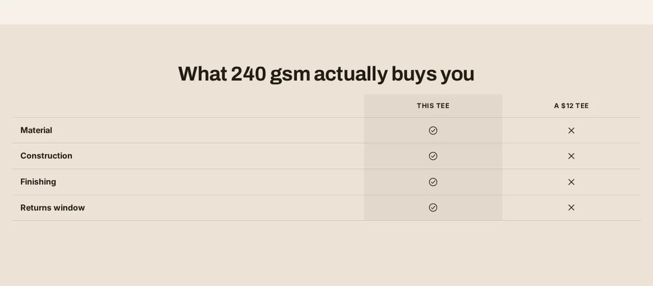
The table, with the marked column shaded 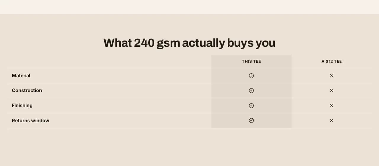
In place on a page
There is no "compare against a brand" button, on purpose
You can type whatever you like into a column heading, including a competitor's name. What the theme does not give you is an affordance that invites it.
Naming a rival turns this section into comparative advertising, which in the UK and the EU must be objective, verifiable and about materially relevant features. Generic headings — "Ours", "A typical £12 tee" — carry no such duty. A theme that put a competitor picker one click away would be handing merchants a legal exposure they did not ask for and probably would not notice taking on.
If you do name somebody, it is your claim, made deliberately. That is a meaningfully different thing from a theme making it the path of least resistance, and it is the same reasoning behind everything else this theme refuses to generate.
What it does on a phone
It scrolls sideways. It does not reflow into stacked cards.
Reflowing is the more fashionable answer and it destroys the feature: the whole value is seeing two columns beside each other, and a stack shows you one at a time — which is the state the shopper was already in before they found your table. The scrolling region is reachable by keyboard and announced as a region, so a second column is not something only a mouse can reach.
The cells say what you put in them
Each row is yes, no, or your own text. Nothing is computed, nothing is inferred from your product data, and no cell fills itself in with a default that reads as a claim. A row you have not filled in does not render as a confident "no".
Which edition
Pro. The pricing page lists everything in each edition, generated from the theme's own build.