Función
Funciones
Funciones de Shopify sin app — tabla de tallas, botón de compra fijo, barra de envío gratis, packs, descuentos por cantidad, upsell en el carrito y más — cada una integrada en Hullara como una sección que configuras en el editor de temas, y qué edición la incluye.
Esta página solo está disponible en inglés.
104 features, each one a section, a block or a setting you switch on in the theme editor — none of them an app to install. Every Pro theme has at least 88 of them, and every Core theme at least 61.
Raise the order value
Bundles, volume tiers and add-ons that put more in each cart, without an app per offer.
 Pro
Product bundles
Offer a set of products you already sell and add the whole set to the cart in one tap.
Instead of an app: Bundles / buy-the-setHow it works →
 Pro
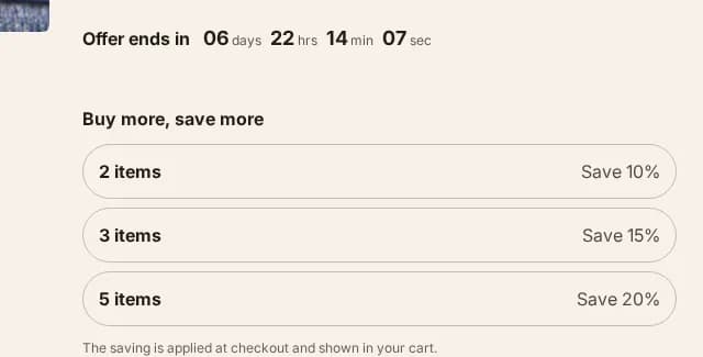
Quantity breaks
Buy-2, buy-3 tiers on the product page that set the real quantity, with the saving applied by your own Shopify discount.
Instead of an app: Quantity breaks / tiered pricingHow it works →
 Pro
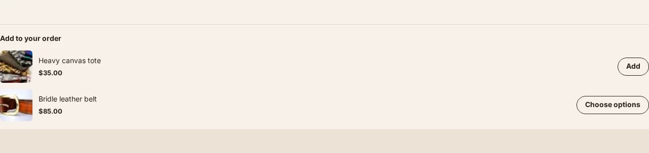
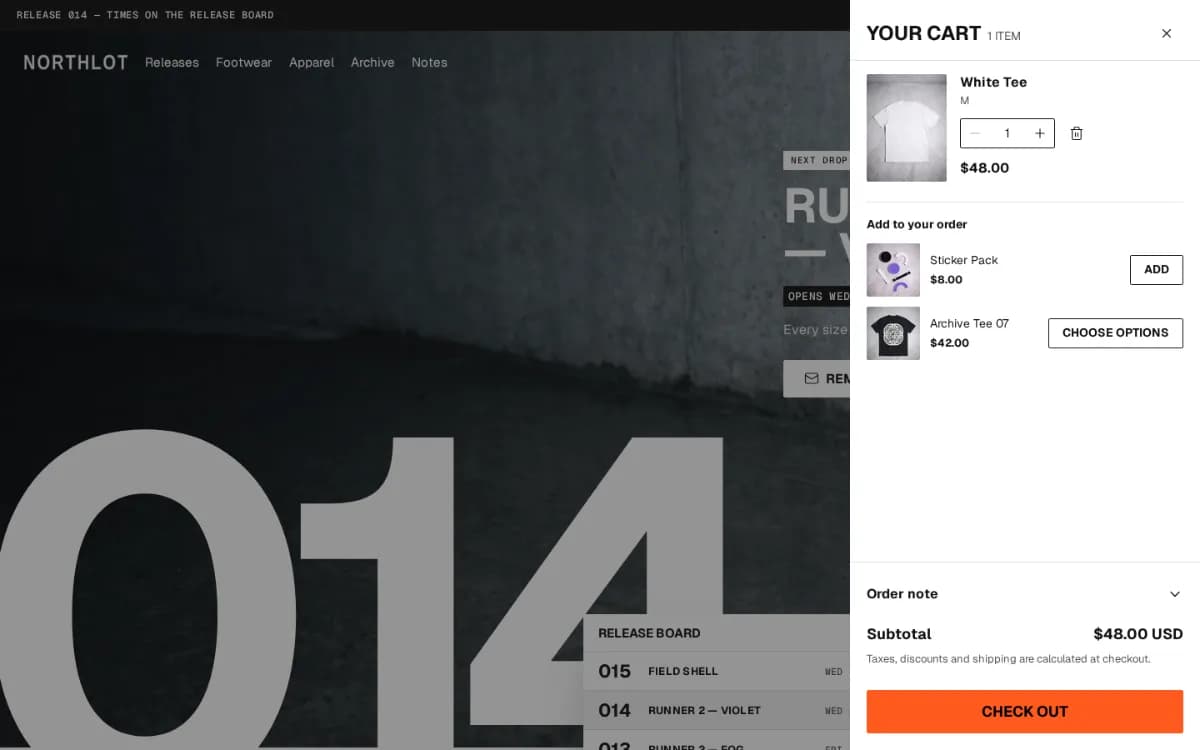
Cart upsell
One relevant add-on inside the cart drawer and on the cart page, from products you pick.
Instead of an app: Upsell and cross-sellHow it works →
 Pro
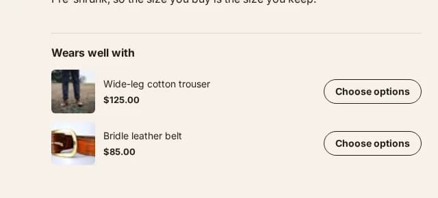
“Pairs well with” on the product page
Complementary products beside the buy button, from Shopify's recommendations or a list you curate.
Instead of an app: Related / complementary products
 Core & Pro
Free-shipping progress bar
Shows how far the cart is from free shipping, in the drawer and on the cart page.
Instead of an app: Cart drawer / free shipping barHow it works →
 ProReplenish only
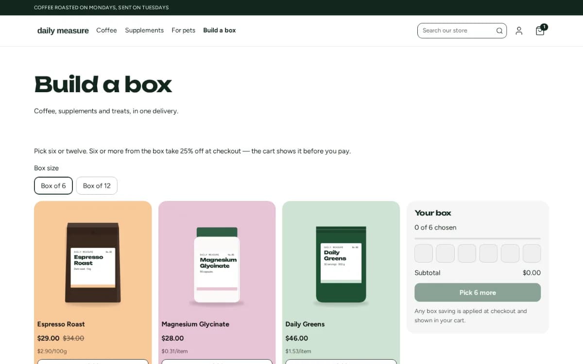
Build-a-box
Shoppers pick a set number of products from a collection and add them as one box.
“You may also like”
Core & ProRecommendations Shopify chooses from real shopping behaviour, on the product page or anywhere else.
A free-shipping threshold per currency
Core & ProSet the threshold in each currency you sell in, so a shopper in yen is never told to spend ¥50 more.
Gift wrap in the cart
ProA gift-wrap option and a gift message in the cart, charged as a product you choose.
Turn a product page into an order
Everything a shopper checks before pressing buy — sizes, delivery, stock, the price in full — on the page, not behind a link.
 Core & Pro
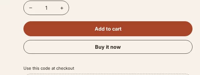
Sticky add to cart
A buy bar that follows the shopper down the page, naming the size and colour they chose.
Instead of an app: Sticky add-to-cart barHow it works →
 Core & Pro
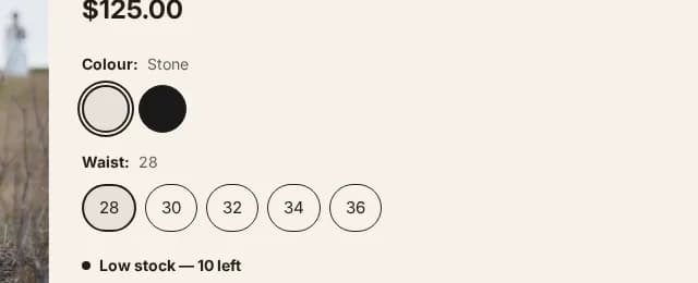
Option buttons and colour swatches
Sizes as buttons and colours as swatches drawn from Shopify's own colour data, with sold-out options marked.
Instead of an app: Variant swatchesHow it works →
 Core & Pro
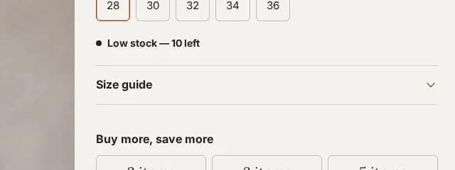
Size chart
A size chart that opens over the product page, from a page you write or one per product.
Instead of an app: Size chartsHow it works →
 Pro
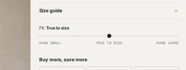
Fit scale
Runs small, true to size or runs large — set per product, and silent until you set it.
 Core & Pro
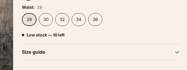
Stock level from your real inventory
A low-stock meter and note that read Shopify's own count — there is no field to type a number into.
Instead of an app: Inventory / scarcity display
 Core & Pro
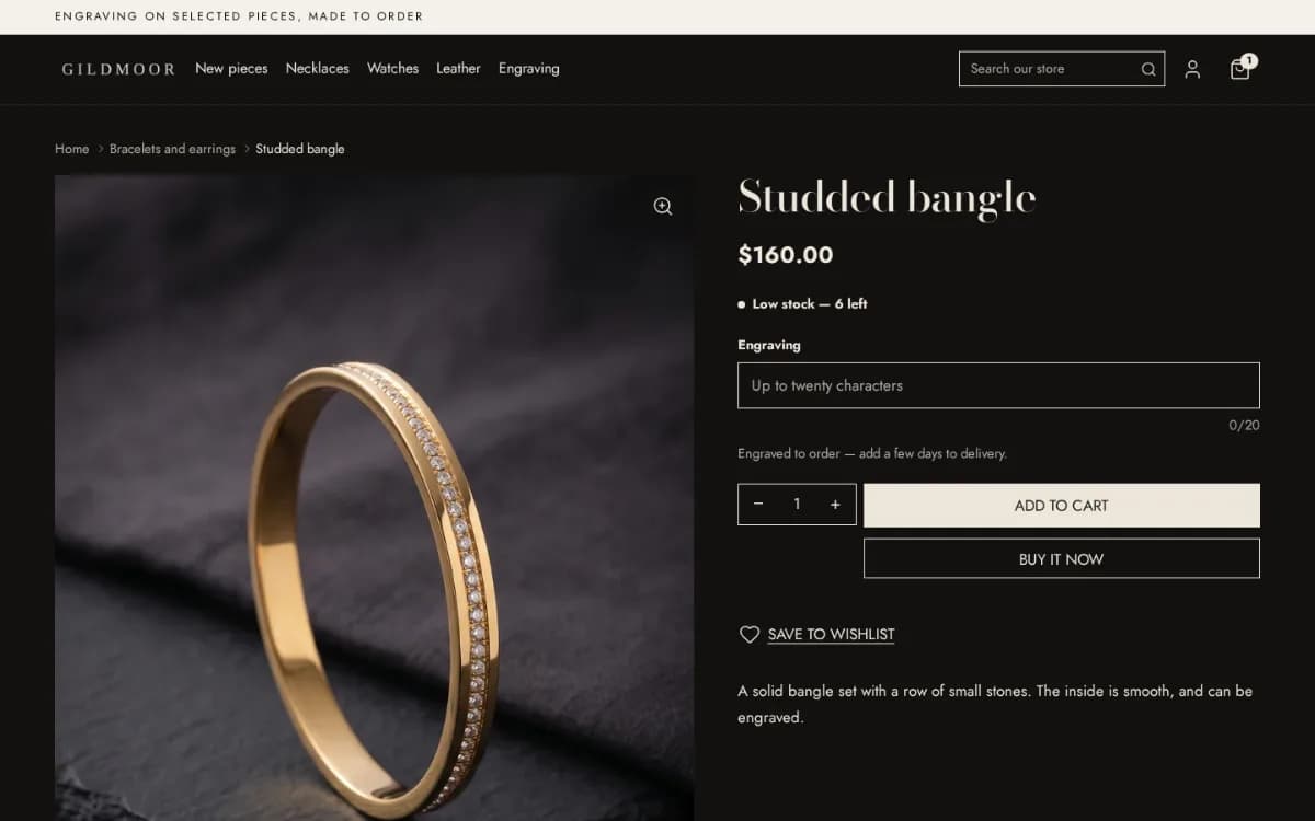
Personalisation with live preview
A text field for engraving or a monogram, counted to your limit and previewed on the page as it is typed.
 Core & Pro
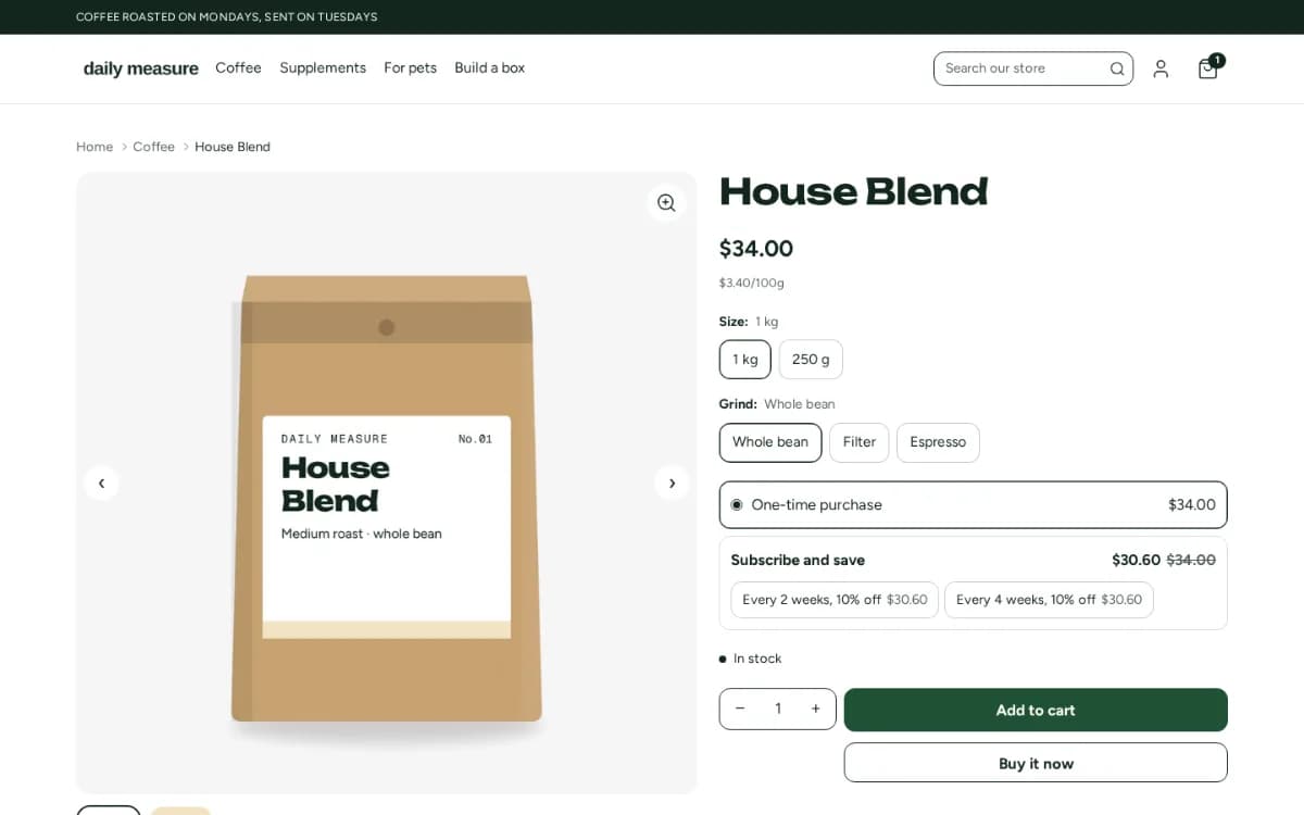
Subscribe-and-save on the product page
One-time or subscription as a choice beside the price, from the selling plans your subscription app sets up.
 Pro
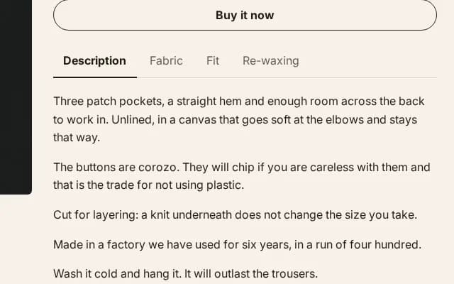
Product tabs
The description and your extra panels as tabs instead of one long column.
Instead of an app: Product tabs and accordions
 Pro
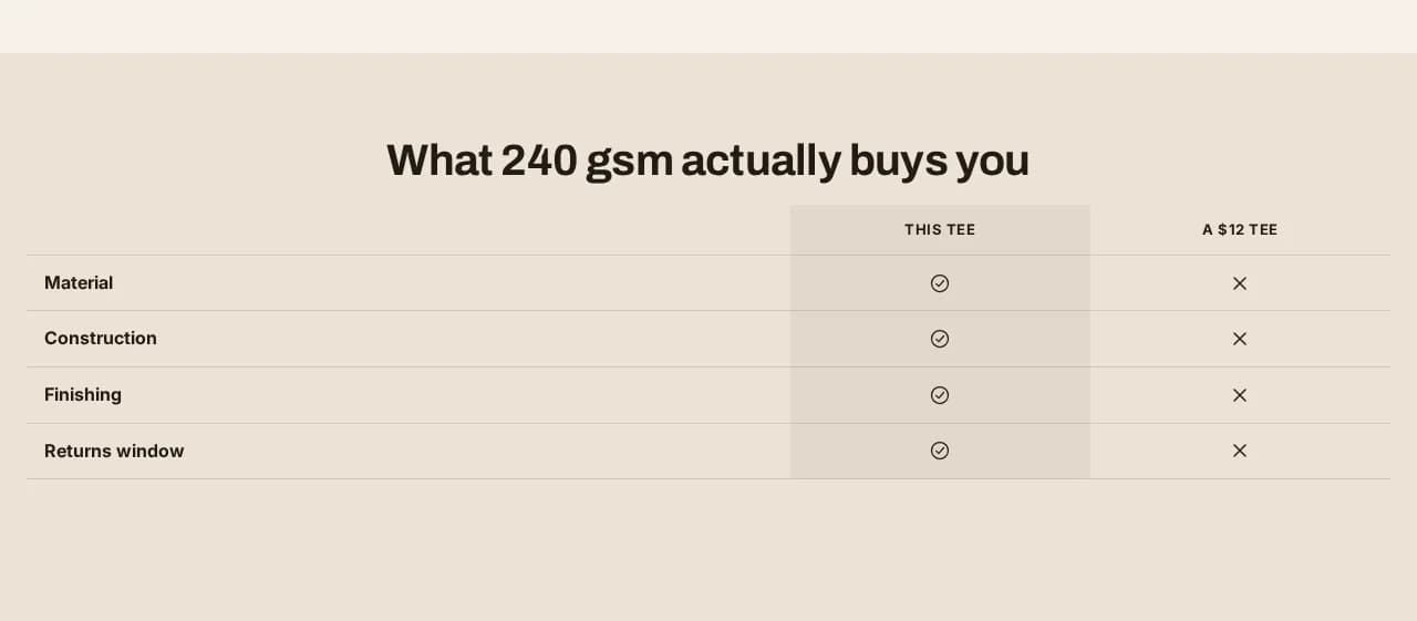
Comparison table
Your product against the alternative, row by row on the points that decide the sale.
Instead of an app: Comparison tablesHow it works →
 Pro
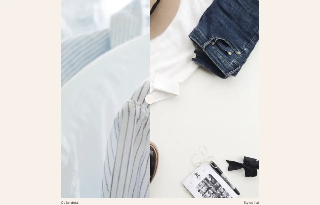
Before-and-after slider
Two photographs with a handle to drag between them, for a result a picture can prove.
Instead of an app: Image comparison
 Pro
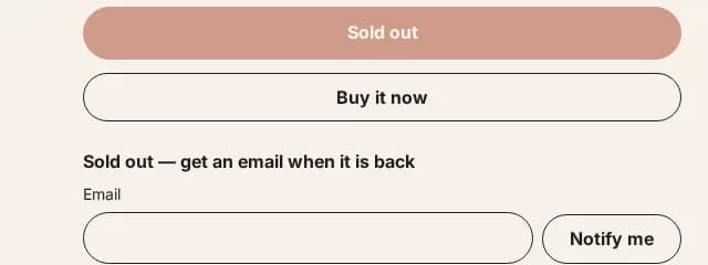
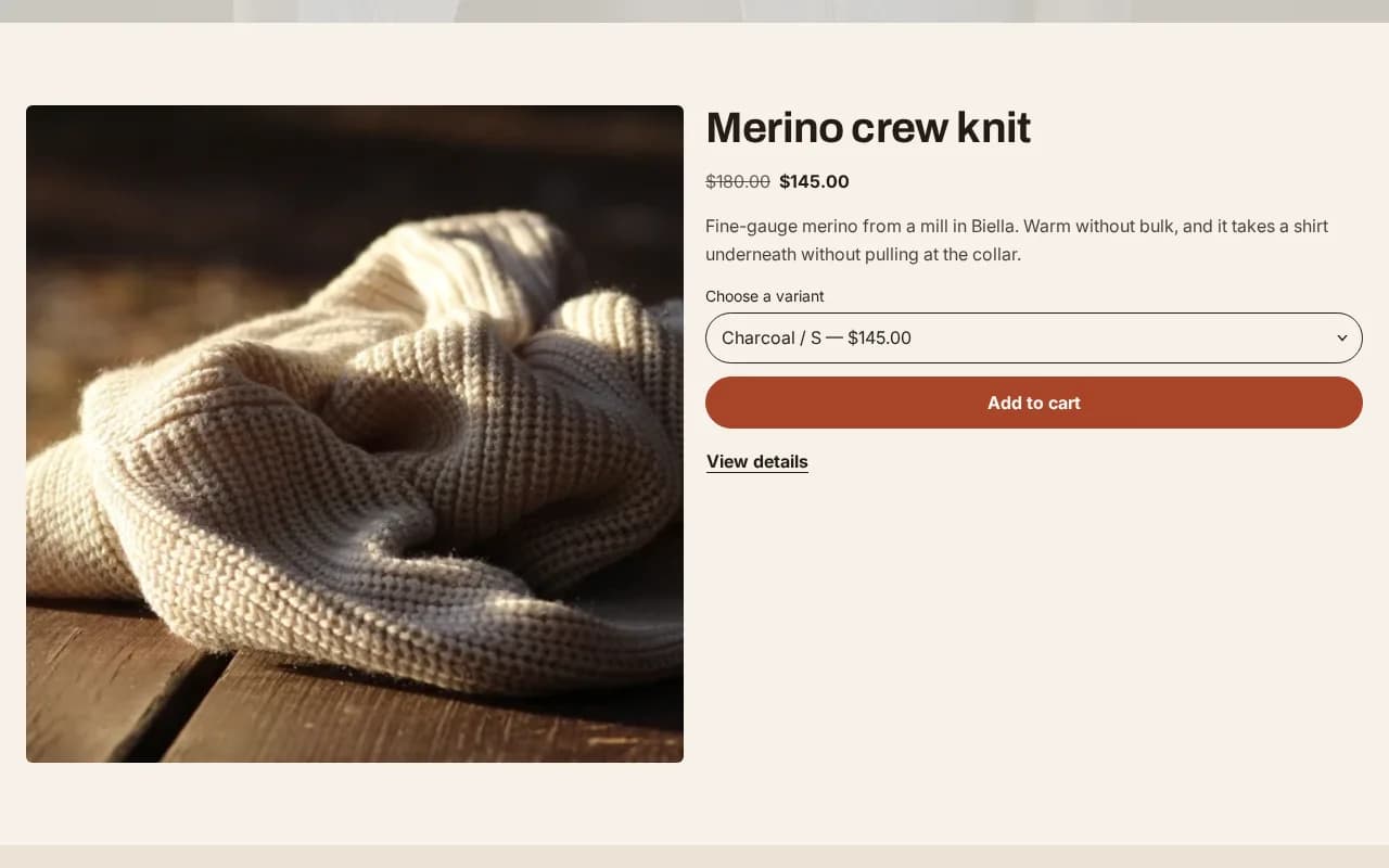
Back-in-stock requests
A “tell me when it's back” field under a sold-out size, sent to your inbox or tagged for a Shopify Flow email.
 Core & Pro
A product, bought from any page
One product with its gallery, options and buy button, placed on the homepage or any page.
Separate products shown as one, by colour
Core & ProLink a product per colour so each colour has its own page, images and reviews, switched with swatches — on any Shopify plan.
Gallery that follows the chosen colour
Core & ProPick a colour and its photographs come first, with zoom on every image.
Gallery layouts: collage, grid, stacked
ProChoose how the product photographs are laid out on desktop, and how a phone shows its place in the set.
Full-screen image viewer
Core & ProOpen any product photograph full screen and magnify it.
Lightbox styles and backdrops
ProFour viewer styles and three backdrops, also on pictures in pages and blog posts.
Product video and 3D models
Core & ProVideos and 3D models you upload to the product play in its gallery.
Delivery estimate
Core & Pro“Arrives between …” counted in business days from your own dispatch and delivery times.
In-store pickup availability
Core & ProShows which of your locations has the chosen variant ready for pickup.
Trust badges and payment icons
Core & ProDelivery, returns and secure-checkout promises and the cards you accept, under the buy button.
Instead of an app: Trust badges
Express checkout buttons
Core & ProShop Pay, Apple Pay and the other express buttons Shopify offers, on the product page and in the cart.
Pre-order button
Core & ProSell a product before it is in stock, with the date it ships said on the page.
Unit price
Core & ProPrice per 100 g or per litre beside the price, where Shopify has one for the product.
Star rating from your review app
Core & ProReads the rating your review app stores on the product, and shows nothing where there is none.
Specifications from metafields
Core & ProA specification table filled from the product's own metafields, so each product carries its own.
A note per variant
Core & ProA line that changes with the chosen variant — “ships in 2 weeks”, “final sale” — from a variant metafield.
Folding information rows
Core & ProMaterials, care and shipping in rows that open on tap, from text, a page or a metafield.
Help shoppers find the right product
Menus, search, filters and cards that get a visitor from the homepage to the product they came for.
 Core & Pro
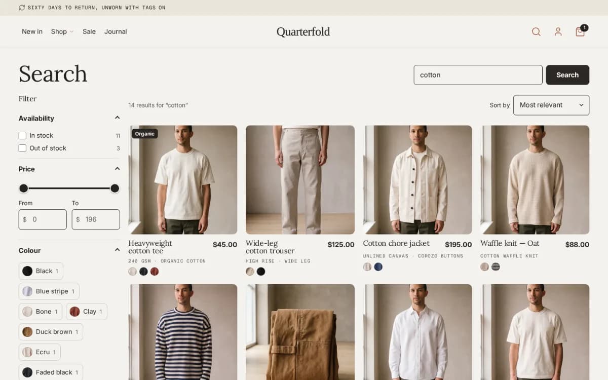
Search with suggestions
A search overlay with products, collections and pages as the shopper types, and a menu of popular searches.
 Core & Pro
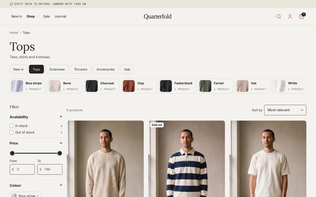
Filters and sorting
Filter by any option, price range or availability, in a sidebar or a phone sheet that says how many products match.
 ProApparel, Drop, Editorial, Replenish
Collection chips above the grid
A row of collections from one of your menus, as chips or round pictures, with the current one marked.
 ProApparel, Drop, Editorial, Replenish
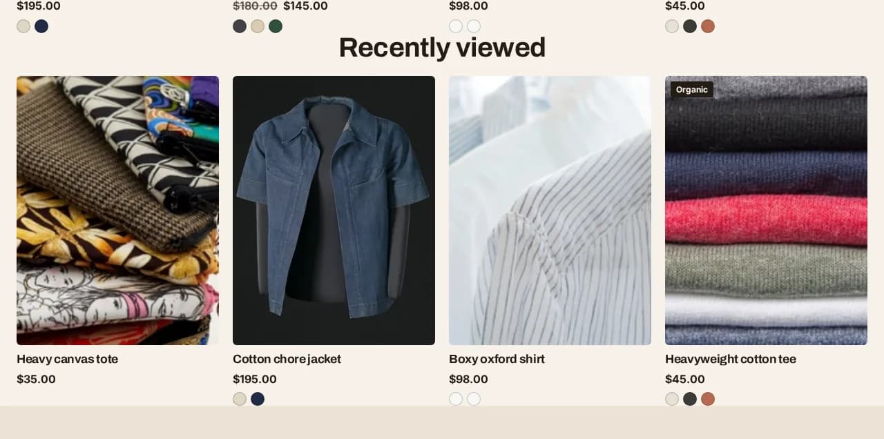
Recently viewed
The products this shopper looked at, newest first, kept in their own browser with their consent.
 ProEditorial only
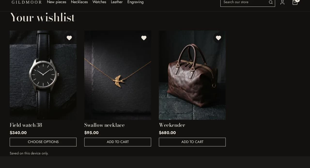
Wishlist
A heart on cards and the product page, and a page that lists what the shopper saved — no account needed.
Sticky header
Core & ProThe menu, search and cart stay in reach while the shopper scrolls.
Transparent header over the hero
ProThe header sits over your homepage picture, with its own logo, until the shopper scrolls.
Infinite scroll
ProThe next page of products loads as the shopper reaches the bottom of a collection or search.
Promotion tiles in the product grid
ProA picture or a featured product placed between products in a collection or search result.
Quick view
Core & ProChoose a size and add to cart from the collection page, without opening the product.
Instead of an app: Quick viewHow it works →
Quick add from the product card
Core & ProAn add button on every product card, so a one-size product goes straight into the cart.
Sizes on the product card
ProPick a size right on the card in the grid, and a compact “+” add button.
Second photograph on hover
Core & ProA product card shows its next picture when the shopper points at it.
Sale and sold-out badges
Core & ProBadges on product cards and the product page, from the price and the stock Shopify already knows.
Percentage-off and tag badges
ProShow a sale as “−20%”, and turn a product tag such as badge:New into a badge.
Product rows and carousels
Core & ProApparel, Drop, Editorial, ReplenishA row or a carousel of products from one collection, anywhere on any page.
Collection grids and carousels
Core & ProApparel, Drop, Editorial, ReplenishYour collections as a grid or a carousel of pictures.
Run promotions and grow your list
Real deadlines, codes and email capture — each one ends when you said it would.
 Pro
Countdown to a real deadline
A bar across the site and a timer on the product page, both counting to the date you set and gone when it passes.
Instead of an app: Countdown timer
 Pro
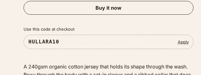
Discount code, applied in one tap
Show a code on the product page that the shopper applies with one press instead of remembering it.
Instead of an app: Discount / promo code
 Pro
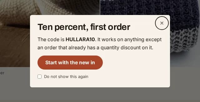
Email popup with exit intent
Email capture after a delay, a scroll depth or when the shopper is about to leave — shown once, not on every page.
Instead of an app: Popups and newsletter capture
 Core & Pro
Newsletter signup
An email signup as a section anywhere and in the footer, sent straight to Shopify's customer list.
Rotating announcement bar
Core & ProSeveral messages above the header, taking turns, each with its own link.
Scrolling ticker
Core & ProA line of short claims that scrolls sideways across the page.
Earn trust and stay compliant
Proof a buyer can check, and the controls the law asks some shops to have.
 Pro
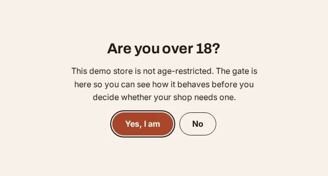
Age verification
An age check in front of the whole storefront, for a catalogue that is required to have one.
Instead of an app: Age verification
Customer quotes
Core & ProQuotes from customers who gave you permission, with no star rating typed in by hand.
Logo row
Core & ProStockists, certifications or payment marks in a row or a carousel.
Press coverage
ProQuotes from publications that wrote about you, each with its masthead and a link to the piece.
Promise row
Core & ProFree delivery, easy returns, a guarantee — short promises with an icon each.
FAQ section
Core & ProQuestions and answers that fold open, from blocks, a metafield or a list of metaobjects.
Contact form with your own fields
Core & ProA contact form that emails you, with the text, choice and checkbox fields you add to it.
Discourage image copying
Core & ProSwitch off right-click, dragging and text selection on your pictures.
Tell your brand's story
Layouts for pictures, video and writing, so the homepage and the journal look like your shop.
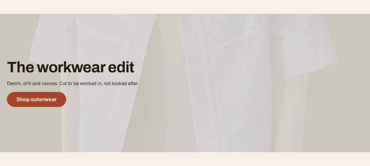 Core & Pro
Hero banner
A photograph with your heading, text and button over it, loaded first so the page is fast.
 Pro
Shoppable lookbook
A styled photograph with dots on it, each opening the product in the shot.
Instead of an app: Shoppable images / lookbooksHow it works →
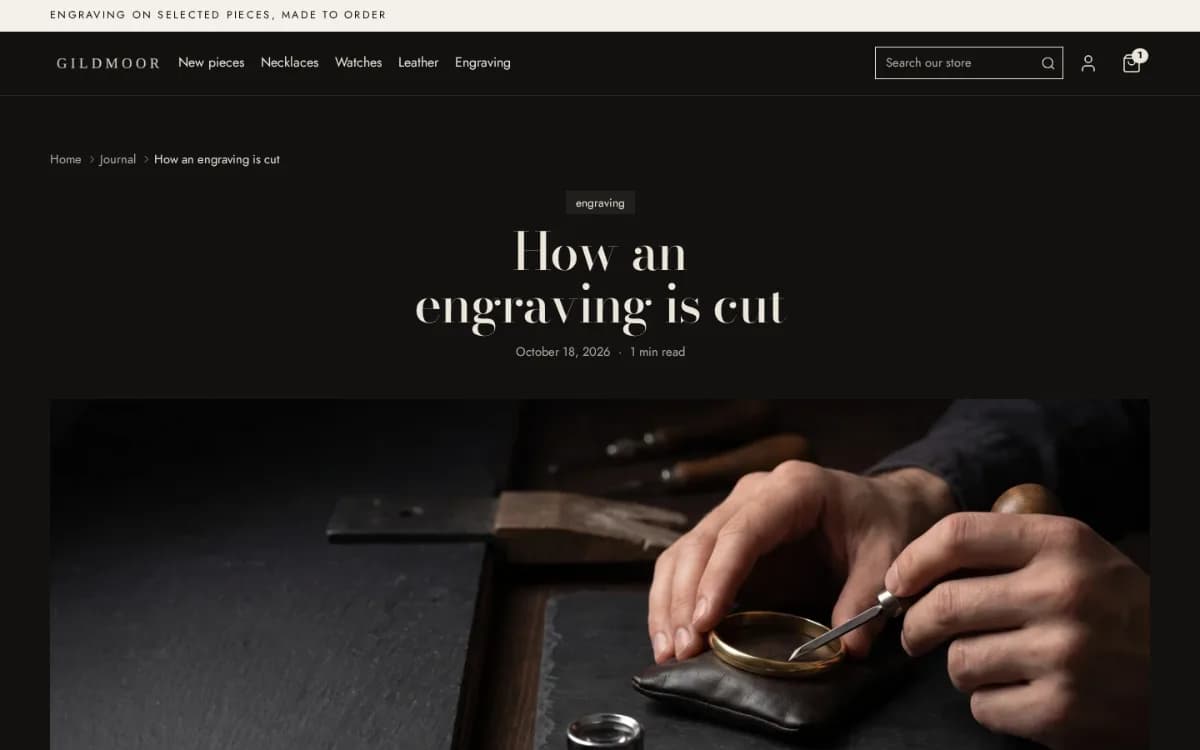 Core & Pro
Blog with contents, reading time and related posts
Articles with a table of contents, reading time, an author bio and related posts underneath.
Slideshow, collage and image-with-text
Core & ProThe common layouts as presets of one flexible section: slides, a collage, a picture beside text.
Bento grid
Core & ProTiles of different sizes, each in its own colour, filled in from a product you pick.
Two photographs, styled together
Core & ProApparel onlyA pair of pictures overlapped or side by side, for an editorial look on any page.
Video section
Core & ProA video from your files, YouTube or Vimeo, loaded only when the shopper reaches it.
Text sections
Core & ProA heading and a paragraph in a readable column, for your story or a policy.
Blog posts on any page
Core & ProThe latest posts from a blog as cards on the homepage or a product page.
Colour schemes per section
Core & ProDefine your colour schemes once and give each section its own.
Motion on scroll
Core & ProSections that rise into view as the shopper scrolls, switched per section and off for anyone who asks for less motion.
Your own code, in a section
Core & ProPaste Liquid, HTML or a script into a section of its own, without editing a theme file.
Coming-soon page
Core & ProA password page with your logo and an email signup while the shop is closed.
Back to top
Core & ProA button back to the top of long pages, shown once the shopper has scrolled.
Social links and Follow on Shop
Core & ProYour social accounts in the footer, and the Follow on Shop button for the Shop app.
Built for the way you sell
The pieces each theme was made for: drops that open on their own, a single product told in full, colours side by side, boxes built by the shopper.
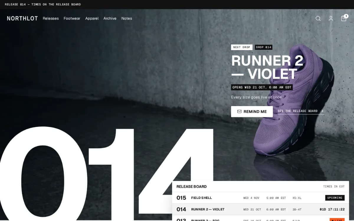 Core & ProDrop only
Drop hero
One drop set large — its number, name and opening time — that moves on by itself as drops open.
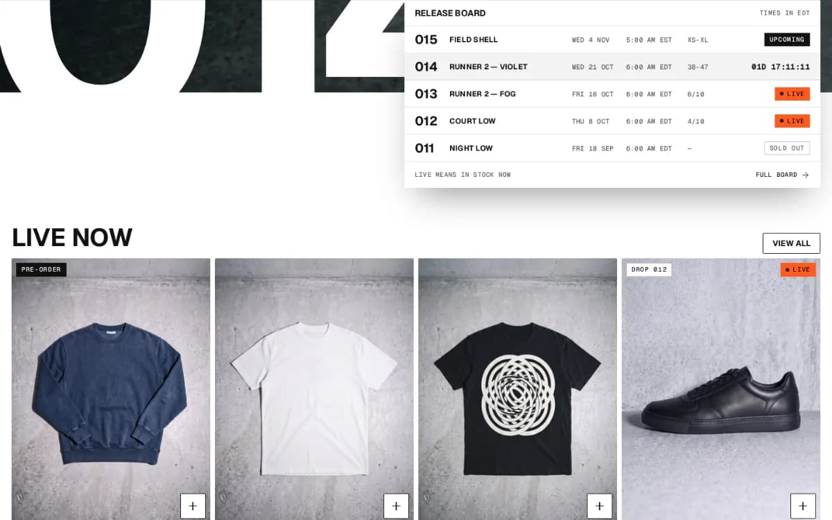 Core & ProDrop only
Release board
Every drop of a collection as cards or a table, with a status that comes from your real stock.
 Core & ProDrop only
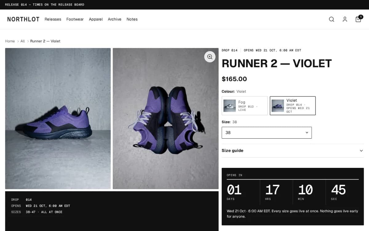
Release status on the product page
Upcoming, live or sold out on the product page, read from the product's opening date and stock.
 ProDrop only
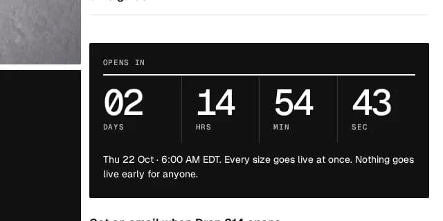
Countdown to a drop opening
Counts to the stored opening time on the product page and stops there.
 ProDrop only
Release calendar
A collection's drops on the days they open, a month at a time.
 ProDrop only
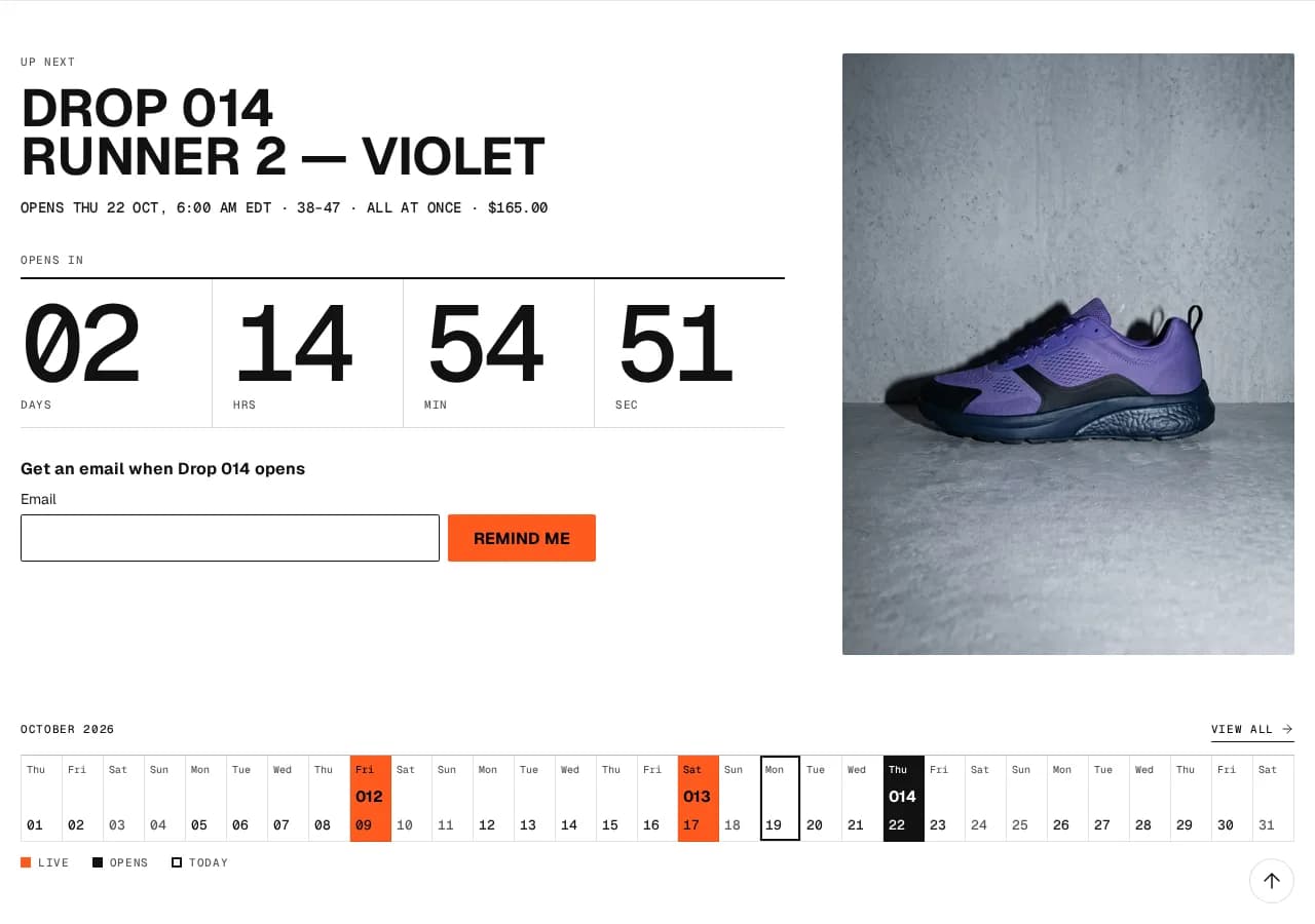
Up next
The next drop in full — sizes, price, a countdown and a reminder form — beside the month around it.
 Core & ProOne Product only
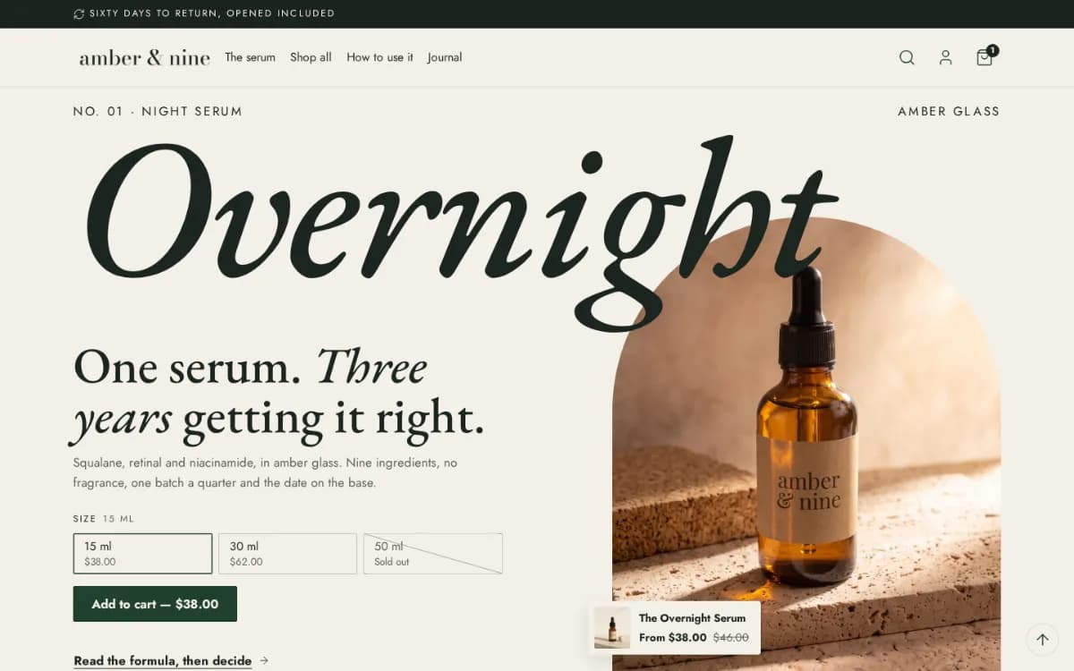
Product hero
One product as the first thing on the page, its name across the full width and the buy box under it.
 Core & ProOne Product only
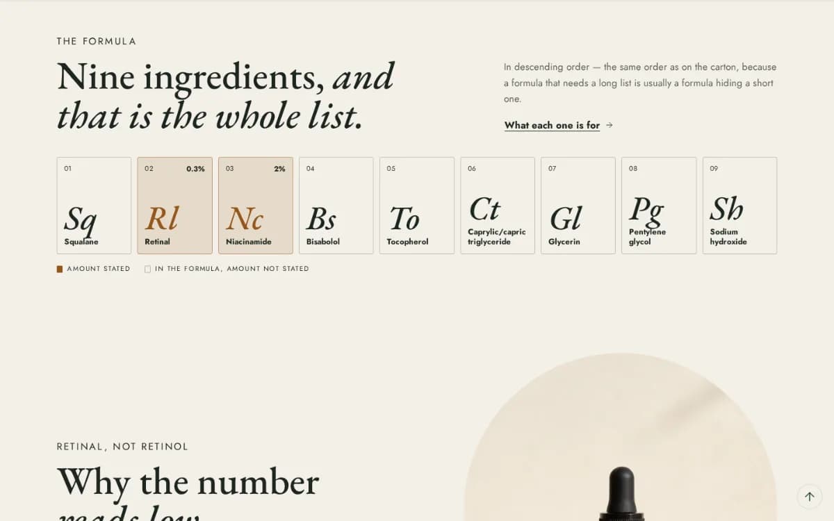
Ingredients and formula
What is in the product, ingredient by ingredient, as tiles or a table with why each is there.
 Core & ProOne Product only
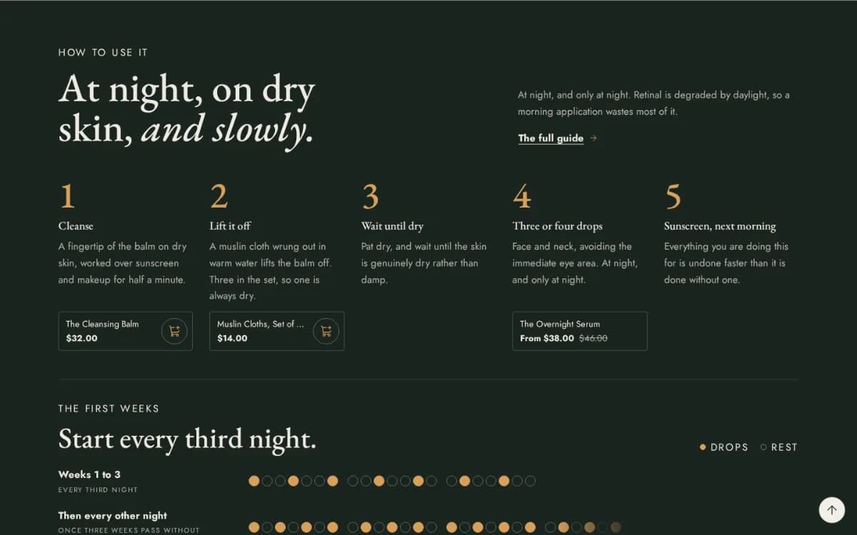
How-to-use steps
Numbered steps with a picture and a product each, and the first weeks of use laid out under them.
 ProApparel only
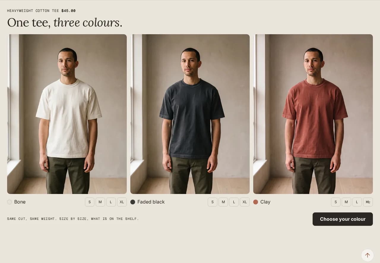
Every colour side by side
One product in all its colours, each with its own picture and sizes, sold-out sizes struck.
 ProApparel only
Colour shelf filter
A collection's colours as a row of swatches above the grid, each one a filter.
Release rules
Core & ProDrop onlyOne statement set large and your rules for a drop under it — limits, raffles, returns.
Routine order
Core & ProOne Product onlyA collection's products in the order they are used, numbered, each with a line of its own.
Collection introduction with counted facts
Core & ProOne Product onlyA collection's name set large, its description and facts counted from its products — how many, from what price.
Sell abroad and to businesses
Languages, currencies and the B2B parts of Shopify, shown the way your customers expect.
Country and language selectors
Core & ProLet shoppers pick their country, currency and language in the header or the footer.
Currency codes on every price
Core & ProShow “$20 CAD” rather than “$20” when you sell in more than one dollar.
Quick order list for B2B
Core & ProEvery variant of a product with a quantity field each, added to the cart in one go, with your B2B quantity rules shown.
B2B volume pricing
Core & ProThe price breaks a B2B catalog sets, shown on the product page to the company buying.
Feature guides, in depth
Most Shopify stores pay a monthly app for each small job on the product page or in the cart: a size chart, a buy button that follows the shopper down the page, a free-shipping bar, a bundle offer. Each one is a fee, and usually a script of its own on every page. In Hullara each of these is a section or a block already in the theme, set up in the theme editor like any other. These pages take one job each: what it does for your shop, how to set it up, and which edition has it.
Jobs every edition does without an app
In every Hullara theme, Core and Pro alike, switched on from the theme editor.
Size chart
How do I add a size chart to Shopify product pages without an app?
Sticky add to cart
How do I add a sticky add to cart button to Shopify without an app?
Free shipping bar
How do I show a free shipping progress bar in the Shopify cart without an app?
Colour swatches
How do I show colour swatches on Shopify without an app, and why does Base color say it can't be blank?
Quick view
How do I let shoppers preview a product from the collection page without an app?
Engraving and personalisation
How do I add engraving or a personal note to a Shopify product without an app?
Subscriptions
How do I show subscribe-and-save next to the price on a Shopify product page?
Launch countdown
How do I show a Shopify product before launch, with Add to cart closed until it opens?
What Pro adds
Merchandising sections a store usually installs an app for, in the Pro edition.
Back-in-stock request
How do I let shoppers ask to hear when a sold-out size is back, on Shopify without an app?
Wishlist
How do I add a wishlist to a Shopify store without an app?
Build a box
How do I let shoppers build their own box of products on Shopify without an app?
Quantity breaks
How do I offer a lower price for buying more on Shopify without an app?
Product bundles
How do I sell a product bundle on Shopify without a bundle app?
Cart upsell
How do I suggest one more product in the Shopify cart without an app?
Comparison table
How do I put a product comparison table on a Shopify page without an app?
Shoppable image
How do I make a lookbook image with clickable products on Shopify without an app?
Running the theme
What happens to your work when you customise the theme and when it updates.
Theme updates
Can I update a Shopify theme without losing my customisations?
Theme editor
How much of a Shopify theme can I change without touching code?
Every section, in every theme
64 sections across the themes on sale — 46 in Core and 18 more in Pro. Each one is a section you add in the theme editor, not an app. Names are the ones the editor shows.
- 404 pageCore
The page a visitor sees when a URL does not exist.
ApparelOne ProductDropEditorialReplenish
- Age gatePro
Add it to the Header area: it then asks on every page, and nothing of the shop is shown until the visitor confirms.
ApparelOne ProductDropEditorialReplenish
- Announcement barCore
The strip above the header.
ApparelOne ProductDropEditorialReplenish
- AppsCore
An empty container for a block from an app you have installed.
ApparelOne ProductDropEditorialReplenish
- ArticleCore
One blog post: topics, title and dateline, the featured image, the post you wrote in Shopify admin, then share links, the older and newer posts, and comments if the blog allows them.
ApparelOne ProductDropEditorialReplenish
- Back to topCore
A button back to the top of long pages.
ApparelOne ProductDropEditorialReplenish
Two photographs of the same thing with a handle to drag between them.
ApparelOne ProductDropEditorialReplenish
- Bento gridCore
Tiles of different sizes on one grid, each in its own color scheme.
ApparelOne ProductDropEditorialReplenish
- Blog postsCore
The list of posts in a blog, as a grid or a list, with the newest post featured and a row of topics to filter by.
ApparelOne ProductDropEditorialReplenish
- Build a boxPro
Shoppers pick a set number of products from one collection and add them to the cart as one box.
Replenish
- BundlePro
Several products offered together and added in one tap — from a list, item blocks with quantities, a product metafield or complementary products.
ApparelOne ProductDropEditorialReplenish
- CartCore
The cart page.
ApparelOne ProductDropEditorialReplenish
- Cart drawerCore
The slide-out cart.
ApparelOne ProductDropEditorialReplenish
- Cart upsellPro
A short row of suggestions inside the cart, from the products chosen in Theme settings → Cart.
ApparelOne ProductDropEditorialReplenish
Questions and answers, or anything that is long enough to be worth folding away.
ApparelOne ProductDropEditorialReplenish
A collection's name set large, its description and a few facts counted from its products: how many there are, the lowest price, or how many carry a tag.
One Product
A row of collections from one of your menus, shown as chips or round pictures.
ApparelDropEditorialReplenish
- Collection listCore
A grid of collections rather than products.
ApparelDropEditorialReplenish
- Collections listCore
The page that lists all your collections.
ApparelDropEditorialReplenish
- Color runPro
One product with every color side by side: each color’s own picture and its sizes, struck where that color is sold out.
Apparel
- Color shelfPro
A collection’s colors as a row of swatches above its products, each one a filter.
Apparel
- Columns and rowsCore
The general-purpose layout section: rows, columns and any blocks you like inside them.
ApparelOne ProductDropEditorialReplenish
A table comparing your product against an alternative.
ApparelOne ProductDropEditorialReplenish
- Contact formCore
A contact form that emails the address on your Shopify account.
ApparelOne ProductDropEditorialReplenish
- Cookie consentCore
Which banner appears is set in Theme settings, under Protection.
ApparelOne ProductDropEditorialReplenish
A bar counting down to a date you set.
ApparelOne ProductDropEditorialReplenish
- Custom LiquidCore
A place to paste your own Liquid, HTML or a script.
ApparelOne ProductDropEditorialReplenish
- Drop heroCore
One drop in big: its number across the picture, its name, when it opens and a way to be reminded.
Drop
A row of products from one collection.
ApparelDropEditorialReplenish
- Featured productCore
One product, given a whole section.
ApparelOne ProductDropEditorialReplenish
- FooterCore
The footer.
ApparelOne ProductDropEditorialReplenish
- FormulaCore
What is in the product, ingredient by ingredient in the order the label gives: numbered tiles, a table with where each comes from and why it is there, or only the stated amounts set large.
One Product
- HeaderCore
The top bar: logo, navigation, search, account and cart.
ApparelOne ProductDropEditorialReplenish
- Icon barCore
A row of short promises with an icon or an image above each — delivery, returns, guarantees.
ApparelOne ProductDropEditorialReplenish
- Image bannerCore
A photograph with your own heading, text and button laid over it.
ApparelOne ProductDropEditorialReplenish
A few posts from a blog, on any page, as the blog's own cards.
ApparelOne ProductDropEditorialReplenish
- Logo listCore
A row of logos — stockists, press, certifications, payment marks.
ApparelOne ProductDropEditorialReplenish
- Minimal pageCore
A plain stand-in page.
One Product
- NewsletterCore
An email signup.
ApparelOne ProductDropEditorialReplenish
- Order of useCore
A collection's products in the order they are used, numbered, each with a line: from a number metafield on each product (its step) and a text metafield (its line), or from this section's blocks.
One Product
- PageCore
A page you wrote in Shopify admin.
ApparelOne ProductDropEditorialReplenish
- PasswordCore
What visitors see while your store is password-protected.
ApparelOne ProductDropEditorialReplenish
Quotes from publications that wrote about you, each with its masthead or name and a link to the piece.
ApparelOne ProductDropEditorialReplenish
- Product gridCore
A collection's product grid, with filtering and sorting.
ApparelOne ProductDropEditorialReplenish
- Product heroCore
One product as the first thing on the page: its name set across the whole width, a picture in the theme's shape behind it, and its buy box underneath.
One Product
The product page.
ApparelOne ProductDropEditorialReplenish
'You may also like', chosen by Shopify from real shopping behavior rather than by you.
ApparelOne ProductDropEditorialReplenish
A dialog that opens after a delay or a scroll.
ApparelOne ProductDropEditorialReplenish
- Quick order listCore
Every variant of one product with a quantity field each, applied to the cart in one request.
ApparelOne ProductDropEditorialReplenish
- Quick viewCore
A preview dialog that opens from a product card, so a shopper can choose a size and add to cart without leaving the collection page.
ApparelOne ProductDropEditorialReplenish
The products this shopper looked at on this device, newest first, leaving out the one on screen.
ApparelDropEditorialReplenish
- Release boardCore
The drops of one collection, newest first, as image cards or a table: date, time, drop number, product and status.
Drop
The drops of a collection on the days they open, a month at a time from this one.
Drop
- Release rulesCore
One statement set very large, and your rules under it.
Drop
- Rich textCore
A heading and a paragraph, centered in a readable column.
ApparelOne ProductDropEditorialReplenish
- Scrolling textCore
A line of short claims that scrolls sideways.
ApparelOne ProductDropEditorialReplenish
- Search resultsCore
The search results page: the products, articles and pages that match, in a grid.
ApparelOne ProductDropEditorialReplenish
A styled photograph with clickable dots on it, each opening a product.
ApparelOne ProductDropEditorialReplenish
- StepsCore
How to use it, in numbered steps — each a title, a line or two, an optional picture and an optional product to add — and under them the first weeks as rows of dots, a dot a night.
One Product
- TabsPro
Panels behind tabs — sizing, materials, delivery, care.
ApparelOne ProductDropEditorialReplenish
- TestimonialsCore
Quotes from customers who gave you permission to use them.
ApparelOne ProductDropEditorialReplenish
- Up nextPro
The next drop to open, in full: its number, name, opening time, sizes and price, a countdown to that minute, a reminder form, its picture and the month of releases around it.
Drop
- VideoCore
A video, from a file you uploaded or a YouTube or Vimeo link.
ApparelOne ProductDropEditorialReplenish
- WishlistPro
The pieces a shopper saved with the heart on a card or the product page — kept in their browser, on this device only.
Editorial